Introduction
Visual Paradigm’s AI Column Chart Generator is a powerful tool designed to simplify the creation of professional and visually appealing column charts. By integrating artificial intelligence, it likely automates parts of the chart creation process, such as suggesting optimal chart types or formatting based on your data. This makes it an excellent choice for users across various fields—business professionals, educators, researchers, or anyone needing to visualize data effectively. The tool is part of Visual Paradigm’s broader online productivity suite, which supports a wide range of chart types and diagram creation, all accessible via a cloud-based platform with no installation required.
Key Concepts
1. What is a Column Chart?
A column chart is a data visualization method that uses vertical bars to represent different categories or values. The height of each bar corresponds to the value it represents, making it ideal for:
- Comparing Categories: For example, showing sales figures for different products.
- Tracking Trends Over Time: Such as monthly revenue or website traffic.
- Highlighting Differences: Easily identifying the largest or smallest values in a dataset.
Column charts are widely used in business, finance, marketing, and education due to their simplicity and ability to convey information clearly.
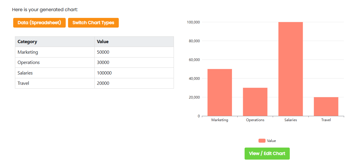
Example – Company spending in areas by category
- Salaries are the largest expenditure, totaling 100,000, indicating significant costs associated with employee compensation.
- Marketing follows closely with 50,000, highlighting the importance of promotional activities.
- Operations and Travel expenses are comparatively lower at 30,000 and 20,000, respectively, suggesting these areas may be more efficient or less costly.
- To optimize spending, consider reallocating funds from less critical areas to enhance marketing efforts and improve employee satisfaction through better salary structures.
This analysis underscores the critical nature of salaries and marketing, while suggesting operational and travel expenses are more manageable.
- Salaries account for the highest expenditure at 100,000, indicating significant costs in personnel.
- Marketing follows with 50,000, highlighting the importance of promotional activities.
- Operations and Travel expenses are relatively lower at 30,000 and 20,000 respectively, suggesting areas for potential cost reduction.
- Consider reallocating some of the Salaries budget to improve operational and marketing efficiencies.
2. Role of AI in Chart Generation
The AI component of Visual Paradigm’s tool likely enhances the chart creation process by:
- Automating Design Choices: Analyzing your data to suggest the best chart type (e.g., standard column, stacked column) or layout.
- Simplifying Input: Allowing users to describe their chart needs in natural language or upload data files, with the AI generating a chart automatically.
- Optimizing Visuals: Recommending color schemes, label placements, or other formatting options to improve readability and aesthetics.
- Saving Time: Reducing the need for manual adjustments, enabling users to create professional charts in minutes.
While specific details about the AI features are not fully available, they are likely integrated into Visual Paradigm’s broader chart-making suite, which supports over 50 chart types, including bar, line, pie, and more.
3. Features of Visual Paradigm’s Chart Maker
Based on information from Visual Paradigm’s online chart maker, the AI Column Chart Generator likely includes:
- Extensive Template Library: Access to professionally designed column chart templates for quick customization.
- Customization Options: Adjust fonts, colors, titles, and legends to match your brand or topic.
- Cloud-Based Access: No software installation needed; create and edit charts from any device with an internet connection.
- Multiple Export Formats: Download charts as PNG, JPG, SVG, or PDF for easy sharing or inclusion in reports.
- Intuitive Interface: Designed for non-designers, with a spreadsheet editor for data input and drag-and-drop functionality.
| Feature | Details |
|---|---|
| Chart Types | Over 50 types, including column, bar, line, pie, doughnut, radar, etc. |
| Templates | Wide range of customizable templates for infographics, reports, etc. |
| Customization | Adjust fonts, colors, titles, legends to match brand or topic |
| Time to Create | Create charts in minutes with AI assistance |
| Export Options | PNG, JPG, SVG, PDF for sharing or publishing |
How to Use Visual Paradigm’s AI Column Chart Generator
While specific instructions for the AI Column Chart Generator are not fully detailed, the process is likely similar to Visual Paradigm’s general chart-making workflow, with AI enhancements. Here’s a step-by-step guide based on available information:
- Access the Platform:
- Visit Visual Paradigm’s online platform at Visual Paradigm Online.
- Sign up for a free account or log in. No credit card is required for the free edition.
- Select Column Chart:
- Navigate to the chart maker section and choose “Column Chart” from the list of supported chart types.
- Choose a Template:
- Browse the library of premade column chart templates, designed by Visual Paradigm’s professional team.
- Select a template that fits your needs or start with a blank chart for full control.
- Input Your Data:
- Use the built-in spreadsheet editor to manually enter data (e.g., categories and values).
- Alternatively, upload a data file (such as CSV or Excel) to populate the chart.
- If AI features are available, you may be able to describe your chart requirements (e.g., “Create a column chart comparing sales for four products”) and let the AI generate the chart.
- Leverage AI Features:
- The AI may analyze your data to suggest the best chart type (e.g., standard vs. stacked column) or formatting options.
- It could automatically adjust scales, colors, or labels to optimize readability and visual appeal.
- Customize the Chart:
- Modify colors, fonts, and other design elements to align with your brand or presentation style.
- Add titles, legends, and axis labels to provide context for your data.
- Use the intuitive editor to fine-tune any aspect of the chart.
- Publish and Share:
- Once satisfied, publish the chart directly from the platform.
- Share it via a unique URL or download it as an image (PNG, JPG, SVG) or PDF for use in reports, presentations, or online content.
Tips for Creating Effective Column Charts
To ensure your column charts are clear and impactful:
- Simplify Data: Focus on key data points to avoid clutter. For example, limit the number of categories to 5–10 for clarity.
- Use Clear Labels: Ensure axis labels, titles, and legends are concise and readable.
- Choose Distinct Colors: Use contrasting colors for different data series, but avoid overly bright or clashing combinations.
- Maintain Consistent Scales: Ensure the y-axis scale is consistent and starts at zero to avoid misleading representations.
- Add Context: Include annotations or percentages to provide additional insights, such as highlighting significant trends.
Examples of Effective Column Charts
Here are some scenarios where column charts excel:
- Sales Performance: A chart showing monthly sales for different products, with each product represented by a different color.
- Example: Product A (150 units), Product B (200 units), Product C (100 units), Product D (300 units).
- Demographic Comparison: A chart comparing population sizes across regions, with regions on the x-axis and population on the y-axis.
- Financial Trends: A stacked column chart showing revenue and expenses over several quarters, with each quarter as a separate column.
Troubleshooting Common Issues
- Data Not Displaying Correctly: Verify your data for errors, such as incorrect formatting or missing values. Ensure the data matches the expected format (e.g., numerical values for the y-axis).
- Chart Appears Cluttered: Reduce the number of categories or data points. Consider using a different chart type, like a line chart, for complex datasets.
- AI Suggestions Not Ideal: If the AI-generated chart doesn’t meet your needs, manually adjust the settings or try a different template.
- Export Issues: Ensure you have a stable internet connection when downloading or sharing. Check file format compatibility with your intended use (e.g., PDF for reports).
Conclusion
Visual Paradigm’s AI Column Chart Generator is a versatile and user-friendly tool that combines the power of artificial intelligence with an intuitive design interface. It enables users to create professional column charts quickly, making it ideal for business reports, academic presentations, or data-driven decision-making. With its cloud-based access, extensive template library, and customization options, this tool empowers users of all skill levels to visualize data effectively. Whether you’re comparing sales figures, tracking trends, or presenting research findings, this tool can help you communicate insights with clarity and impact.