Introduction
Multi-series charts are a powerful way to visualize multiple datasets on a single graph, enabling easy comparison of trends or metrics. For example, you might use a multi-series line chart to compare sales performance across different products over time. Visual Paradigm Online, a cloud-based platform, offers a user-friendly chart maker that supports over 50 chart types, including line, bar, area, and more, many of which can accommodate multiple series. This tutorial provides a step-by-step guide to creating a multi-series chart, with a focus on line charts, which are commonly used for this purpose.
Key Points:
- Multi-series charts display multiple datasets on a single graph, ideal for comparing trends or metrics.
- Visual Paradigm Online likely uses AI to enhance chart creation, such as suggesting chart types or optimizing visuals.
- The process involves selecting a chart type, inputting data, customizing visuals, and sharing the output.
- Exact AI features may vary, but they aim to simplify and streamline chart creation.
What is a Multi-Series Chart?
A multi-series chart displays multiple datasets (or “series”) on the same graph. Each series represents a different variable or category, plotted with its own line, bars, or points. Common types include:
-
Line Charts: Multiple lines showing trends over time.
-
Bar Charts: Grouped or stacked bars comparing categories.
-
Area Charts: Stacked areas showing cumulative data.
-
Scatter Plots: Multiple sets of points for variable relationships.
How Does AI Help?
The AI-powered chart generator in Visual Paradigm Online, accessible at Visual Paradigm Online, likely assists by suggesting the best chart types for your data or enhancing visual designs. This saves time and ensures professional results, even for beginners.

These charts are widely used in fields like finance, economics, and business analytics to highlight patterns and comparisons.
Why Use Visual Paradigm Online?
Visual Paradigm Online is a robust platform for creating professional-quality charts. Its key features include:
-
Flexible Data Management: Easily input or import multiple datasets.
-
Customization Options: Adjust colors, line styles, and labels for clarity.
-
Cloud-Based Access: Work from anywhere and collaborate with teams.
-
Export and Sharing: Save charts as images, PDFs, or shareable links.
The platform’s intuitive interface makes it accessible for both beginners and advanced users.
Step-by-Step Guide to Creating a Multi-Series Chart
Step 1: Access Visual Paradigm Online
-
Open your web browser and navigate to Visual Paradigm Online.
-
Sign in with your existing account or click “Sign Up” to create a free account. No credit card is required for basic access.
Step 2: Navigate to the Chart Maker
-
From the main dashboard, locate the “Charts” section in the menu.
-
Browse the available chart templates. For multi-series charts, select a template such as “Line Charts” or “Bar Charts,” as these support multiple datasets.
Step 3: Select a Chart Template
-
Click on “Line Charts” (or your preferred chart type) to open the chart editor.
-
Choose a pre-designed template or start with a blank canvas for full control.
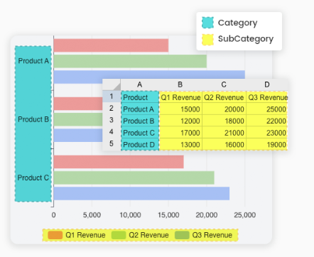
Step 4: Prepare Your Data
Before creating the chart, organize your data in a structured format, such as a spreadsheet. Each series should be a separate dataset. For example:
-
X-axis: Time periods (e.g., months, years).
-
Series: Different variables (e.g., sales for Product A, Product B, Product C).
Here’s a sample dataset for monthly sales of three products:
|
Month |
Product A |
Product B |
Product C |
|---|---|---|---|
|
Jan |
100 | 150 | 200 |
|
Feb |
120 | 160 | 180 |
|
Mar |
130 | 170 | 190 |
|
Apr |
140 | 180 | 210 |
|
May |
150 | 190 | 220 |
|
Jun |
160 | 200 | 230 |
|
Jul |
170 | 210 | 240 |
|
Aug |
180 | 220 | 250 |
|
Sep |
190 | 230 | 260 |
|
Oct |
200 | 240 | 270 |
|
Nov |
210 | 250 | 280 |
|
Dec |
220 | 260 | 290 |
Step 5: Input Your Data
-
In the chart editor, locate the “Data” or “Edit Data” option.
-
Enter your data manually or import it from a spreadsheet (e.g., CSV or Excel file) if the tool supports this feature.
-
Assign the first column (e.g., “Month”) to the X-axis and each subsequent column (e.g., “Product A,” “Product B,” “Product C”) as a separate series.
Step 6: Customize the Chart
-
Add Series: Ensure each dataset is recognized as a separate series. Visual Paradigm Online’s chart maker allows you to add multiple series by selecting additional data columns.
-
Adjust Visuals:
-
Assign distinct colors to each series (e.g., blue for Product A, red for Product B, green for Product C).
-
Add a legend to label each series clearly.
-
Customize axis labels (e.g., X-axis: “Months,” Y-axis: “Sales”).
-
Set a chart title, such as “Monthly Sales Comparison for Products A, B, and C.”
-
-
Fine-Tune:
-
Choose line styles (e.g., solid, dashed) or markers (e.g., dots, squares) for each series.
-
Adjust the chart size and layout to fit your needs.
-
Enable tooltips (if available) to display data values on hover.
-
Step 7: Save and Share
-
Click “Save” to store the chart in your Visual Paradigm Online workspace.
-
Export the chart as an image (PNG, JPEG, SVG) or PDF for presentations or reports.
-
Share the chart with team members by generating a shareable link or inviting collaborators to your workspace.
Example: Creating a Multi-Series Line Chart
Let’s apply the steps to the sample dataset above to create a multi-series line chart.
-
Select Line Chart: Choose a line chart template in Visual Paradigm Online.
-
Enter Data:
-
X-axis: “Month” (Jan to Dec).
-
Series 1: “Product A” (100, 120, 130, …).
-
Series 2: “Product B” (150, 160, 170, …).
-
Series 3: “Product C” (200, 180, 190, …).
-
-
Customize:
-
Assign blue, red, and green colors to Product A, B, and C, respectively.
-
Add a legend to identify each product.
-
Label the X-axis as “Months” and Y-axis as “Sales.”
-
Set the title to “Monthly Sales Comparison for Products A, B, and C.”
-
-
Save and Export: Save the chart and export it as a PNG for inclusion in a report.
The resulting chart will show three lines, each representing the sales trend for one product over the 12-month period, allowing for easy comparison.
Tips for Effective Multi-Series Charts
-
Clear Labels: Ensure the legend clearly identifies each series.
-
Distinct Colors: Use contrasting colors to differentiate series and avoid confusion.
-
Limit Series: Include 3–5 series to maintain readability; too many series can clutter the chart.
-
Proper Scaling: Adjust the Y-axis scale to accommodate all series without distorting trends.
-
Tooltips: If supported, enable tooltips to show exact values when hovering over data points.
-
Check for Null Values: Exclude null or missing data to prevent inaccurate visualizations.
Troubleshooting
-
Data Not Displaying Correctly: Verify that each series is correctly mapped to the corresponding data column.
-
Chart Looks Cluttered: Reduce the number of series or adjust the chart size.
-
Import Issues: If importing data, ensure the file format (e.g., CSV) is compatible and properly structured.
Why Visual Paradigm Online?
Visual Paradigm Online stands out for its:
-
Ease of Use: Drag-and-drop interface and pre-designed templates simplify chart creation.
-
Versatility: Supports over 50 chart types, including those suitable for multi-series data.
-
Collaboration: Cloud-based access allows team members to view and edit charts.
-
Professional Output: Customizable designs ensure charts are presentation-ready.
Conclusion
Creating multi-series charts in Visual Paradigm Online is a straightforward process that involves selecting a chart type, inputting data, customizing visuals, and sharing the result. While the exact interface details may vary, the platform’s robust chart maker and flexible data management make it an excellent choice for visualizing complex datasets. By following this guide, you can create professional-quality multi-series charts to effectively communicate trends and comparisons.