Tutorial: Stacked Column and Line Charts

Introduction
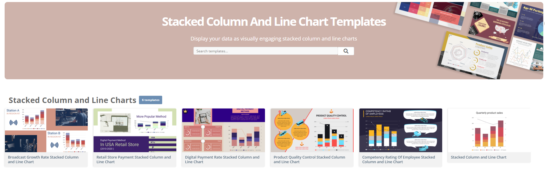
Stacked column and line charts are powerful tools for visualizing data, allowing you to display multiple data series in a single chart. This tutorial will guide you through creating these charts, understanding their components, and their use cases.
What
…Creating a Grouped Column and Line Chart with Visual Paradigm Online

In this tutorial, we will create a grouped column and line chart using Visual Paradigm Online to visualize sales data for different products over several months. This type of chart is useful for comparing quantities across categories while also displaying …
Tutorial: Creating a Column and Line Chart with Visual Paradigm Online

What is a Column and Line Chart?
A Column and Line Chart is a hybrid chart type that combines vertical bars (columns) and a line to represent different datasets on the same graph. This type of chart is particularly useful …
Understanding Stepped Area Charts: A Comprehensive Guide

Stepped area charts are an effective way to visualize data that changes at discrete intervals. Unlike traditional area charts, which smoothly transition between values, stepped area charts emphasize the distinct changes in data, making them ideal for representing categorical data …
Understanding 100% Stacked Area Charts

A 100% stacked area chart is a powerful visualization tool that allows you to display the relative contribution of multiple data series over a given time period, showing how each series contributes to the total. This type of chart is …
Stacked Area Chart: A Comprehensive

Overview
Introduction
Stacked area charts are a powerful data visualization tool that effectively represent how different categories contribute to a whole over time. These charts are particularly useful in fields such as business and finance, where tracking multiple metrics—like revenue, …
Understanding Area Charts: A Comprehensive Tutorial with Examples

Introduction to Area Charts
Area charts are a type of data visualization that display quantitative data as an area filled with a color or pattern. They are particularly useful for visualizing trends and patterns in continuous data over time, such …
Understanding Histograms: A Practical Guide with Real-Life Examples

Histograms are a powerful tool in statistics used to visualize the distribution of numerical data. They provide insights into the underlying frequency distribution of a dataset, making them essential for data analysis in various fields, including business, science, and social …
Tutorial: Creating 100% Stacked Column Charts with Visual Paradigm Online

Introduction
A 100% stacked column chart is a great way to visualize the composition of different categories as a percentage of a whole. Unlike a standard stacked column chart, where the actual values are displayed, a 100% stacked column chart …
Tutorial: Creating a Stacked Column Chart with ECharts

In this tutorial, we will explore how to create a stacked column chart using Visual Paradigm Online Chart, a powerful and flexible charting library. A stacked column chart is useful for visualizing the composition of different categories over time …