Category: Chart
Comprehensive Guide to Using Visual Paradigm’s AI Column Chart Generator
Introduction
Visual Paradigm’s AI Column Chart Generator is a powerful tool designed to simplify the creation of professional and visually appealing column charts. By integrating artificial intelligence, it likely automates parts of the chart creation process, such as suggesting optimal …
Comprehensive Guide to Choosing and Using AI-Powered Chart Generators
Introduction
In today’s data-driven world, visualizing data effectively is crucial for making informed decisions. Whether you’re creating business reports, analyzing marketing trends, or presenting academic research, choosing the right chart type can significantly enhance your data presentation. This guide will …
Tutorial on Rose Charts

What is a Rose Chart?
A Rose Chart (or Polar Area Chart) is a circular graph that displays data in a way that emphasizes the magnitude of values associated with different categories. The length of each segment represents the value …
Unlocking Insights: The Power of Radar Charts for Data Visualization

A radar chart (also known as a spider chart or web chart) is a graphical representation of multivariate data. It displays data in a way that allows for the comparison of multiple variables. Each axis represents a different variable, and …
Tutorial on Double Doughnut Chart Using Visual Paradigm Online

Double Doughnut Charts (also known as comparative Doughnut Charts) are a useful way to visualize hierarchical data in a circular format, allowing viewers to compare two datasets side by side. This tutorial will guide you through the key concepts of …
Doughnut Charts Tutorial

Doughnut charts are a variation of pie charts that display data in a circular format, with a hole in the center. They are often used to show the proportions of various components of a whole, making them useful for visualizing …
Tutorial on Pareto Chart

What is a Pareto Chart?
A Pareto Chart is a type of bar graph that represents the frequency or impact of problems or causes in a descending order. It is based on the Pareto Principle, which states that roughly 80% …
Tutorial: Stacked Column and Line Charts

Introduction
Stacked column and line charts are powerful tools for visualizing data, allowing you to display multiple data series in a single chart. This tutorial will guide you through creating these charts, understanding their components, and their use cases.
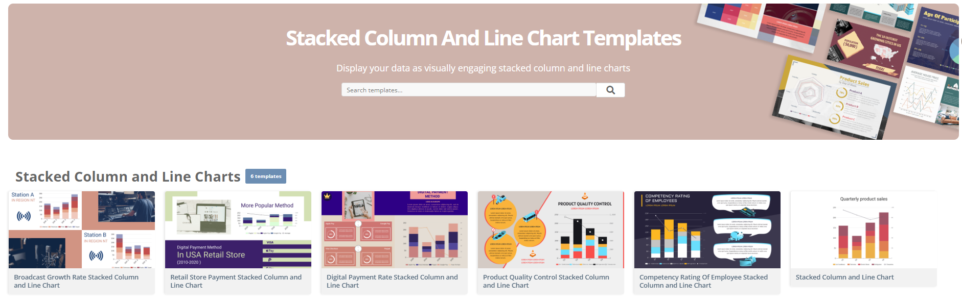
What
…Creating a Grouped Column and Line Chart with Visual Paradigm Online

In this tutorial, we will create a grouped column and line chart using Visual Paradigm Online to visualize sales data for different products over several months. This type of chart is useful for comparing quantities across categories while also displaying …
Tutorial: Creating a Column and Line Chart with Visual Paradigm Online

What is a Column and Line Chart?
A Column and Line Chart is a hybrid chart type that combines vertical bars (columns) and a line to represent different datasets on the same graph. This type of chart is particularly useful …