Introduction
In the world of data visualization, bar charts stand out as one of the most effective tools for comparing discrete data across different categories. Their simplicity and clarity make them a popular choice for presenting information in a way that is easy to understand at a glance. This comprehensive guide explores what bar charts are, their common uses, and how they can be leveraged to enhance data presentation.
What is a Bar Chart?
A bar chart is a graphical representation that uses rectangular bars to display and compare data across different categories. The bars can be oriented either horizontally or vertically, with their lengths proportional to the values they represent. This format allows viewers to quickly grasp differences in magnitude between categories.
Key Features of Bar Charts
- Rectangular Bars: Each bar represents a category, and the length of the bar corresponds to the value of that category.
- Axes: The x-axis typically lists the categories, while the y-axis represents the values.
- Orientation: Bars can be horizontal or vertical, depending on the preference and the nature of the data.
- Labels: Each bar is labeled to indicate the category it represents.
Common Uses of Bar Charts
Bar charts are particularly useful in several scenarios:
Comparing Values Across Categories
Bar charts excel at showing comparisons between different groups. For example, a bar chart can effectively display sales figures for various product types, making it easy to see which products are performing best.
Highlighting Differences
When you need to emphasize differences in size or frequency among groups, bar charts are an excellent choice. For instance, they can illustrate survey responses by demographic group, highlighting which groups have the highest or lowest responses.
Displaying Discrete Data
Bar charts are ideal for displaying data with distinct, separate categories. They are not suitable for continuous data but work well for categorical data.
Example of a Bar Chart
Consider the following example of a bar chart displaying data across four categories: Marketing, Finance, Human Resources, and Information Technology.
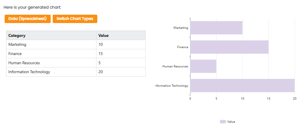
In the bar chart:
- The x-axis lists the categories: Marketing, Finance, Human Resources, and Information Technology.
- The y-axis represents the values, ranging from 0 to 20.
- Each bar’s length corresponds to the value of its category, making it easy to compare the values visually.
Advantages of Bar Charts
- Clarity: Bar charts provide a clear and straightforward way to compare data across categories.
- Ease of Understanding: They are easy to read and interpret, even for viewers who are not familiar with complex data visualization techniques.
- Versatility: Bar charts can be used in various fields, from business and finance to social sciences and healthcare.
Limitations of Bar Charts
While bar charts are highly effective for certain types of data, they have some limitations:
- Not Suitable for Continuous Data: Bar charts are designed for discrete data and are not appropriate for showing trends over time or continuous data.
- Limited to Comparisons: They are best used for comparing values across categories and are not ideal for showing part-to-whole relationships.
Recommended AI Powered Chart Generator
Using an AI-powered chart generator like Visual Paradigm Online offers several advantages that can significantly enhance your data visualization process. Here are some key reasons why you might choose to use such a tool:
1. Ease of Use
AI-powered chart generators are designed to be user-friendly, making it easy for anyone to create professional-looking charts without needing advanced technical skills. The intuitive interface guides you through the process, allowing you to focus on your data rather than the complexities of chart creation.
2. Speed and Efficiency
AI can quickly analyze your data and generate charts in a matter of seconds. This speed and efficiency are particularly beneficial when you need to create multiple charts or when you are working under tight deadlines. The automation of repetitive tasks frees up your time for more strategic activities.
3. Accuracy
AI algorithms are designed to minimize errors and ensure that your charts are accurate representations of your data. This reduces the risk of human error and ensures that your visualizations are reliable and trustworthy.
4. Customization
AI-powered chart generators often come with a wide range of customization options. You can choose from various chart types, colors, styles, and layouts to create visualizations that best suit your needs. This flexibility allows you to tailor your charts to match your brand or presentation style.
5. Data Insights
AI can analyze your data and provide insights that you might not have noticed. For example, it can identify trends, patterns, and outliers, helping you to make more informed decisions. These insights can be invaluable for strategic planning and decision-making.
6. Collaboration
Many AI-powered chart generators, including Visual Paradigm Online, offer collaboration features that allow multiple users to work on the same project simultaneously. This can be particularly useful for teams working on complex projects or for organizations that need to share data and insights across different departments.
7. Integration
AI-powered chart generators often integrate seamlessly with other tools and platforms, such as spreadsheets, databases, and presentation software. This integration allows you to easily import and export data, making the chart creation process more streamlined and efficient.
8. Cost-Effectiveness
Using an AI-powered chart generator can be more cost-effective than hiring a professional designer or purchasing expensive software. Many of these tools offer subscription-based pricing models, allowing you to choose a plan that fits your budget and needs.
9. Scalability
AI-powered chart generators can handle large datasets and generate multiple charts simultaneously. This scalability makes them suitable for both small projects and large-scale data visualization tasks.
10. Continuous Improvement
AI algorithms are constantly learning and improving. As you use the tool, it can adapt to your preferences and provide more accurate and relevant suggestions over time. This continuous improvement ensures that you always have access to the latest features and capabilities.
Using an AI-powered chart generator like Visual Paradigm Online can significantly enhance your data visualization process. The ease of use, speed, accuracy, customization options, data insights, collaboration features, integration capabilities, cost-effectiveness, scalability, and continuous improvement make it a valuable tool for anyone looking to create professional and impactful charts. Whether you are a business professional, a data analyst, or a student, an AI-powered chart generator can help you create visually appealing and informative charts with minimal effort.
Conclusion
Bar charts are a powerful tool for visualizing and comparing data across different categories. Their simplicity, clarity, and versatility make them an essential part of any data analyst’s toolkit. By understanding when and how to use bar charts, you can enhance your data presentations and make complex information more accessible to your audience.
Whether you are comparing sales figures, survey responses, or any other type of categorical data, bar charts provide an effective way to highlight differences and make informed decisions.